DIGITAL MATTE PAINTING - PROJECT 1 INVISIBLE SET EXTENSION
TAN YING YI / 0362425 / BACHELOR OF DESIGN (HONS) IN CREATIVE MEDIA
DIGITAL MATTE PAINTING
PROJECT 1 INVISIBLE SET EXTENSION
INSTRUCTIONS
INVISIBLE SET EXTENTION
PRE-PRODUCTION
Instructions
We will synthesize the knowledge gained in task 1 to apply in task 2. We are to demonstrate technical capability to conceptualize and build assets as a prep for invisible set extension over raw footage or recreate it by scratch from concept to finished art work. We will dissect and deconstruct raw footage to understand the nature and concept of the footage environment requirements for extension.
Fig 1.2 Croping The Base
Fig 1.3 Adjusting base on feedback from lecturer
Scene 1
3 Shots Sketches

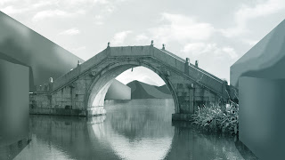
Fig 2.2 Composition and Ambiance: Paint to show value on the base. Used green and blue gradient as ambiance.

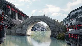
Fig 2.3 Photobashing: Used bridge as the base then added houses and mountains.
Feedback: Perspective is off.
Fig 2.4 More detailed composition
Fig 2.5 Ambiance Study - I would like to make it feel like raining.
Scene 2
3 Shots Sketches
Scene 3
Fig 2.9 Composition Scene 3
Feedback: Too near
INVISIBLE SET EXTENSION
First Attempt
Fig 3.1 Photobashing of One Shot of Scene 1
Fig 3.2 Photobashing of One Shot of Scene 2
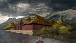
Fig 3.3 Photobashing of Shot 1 of Scene 3
Fig 3.4 Photobashing of Shot 2 of Scene 3
After getting Mr. Kannan's feedback, I decided to work with Photobashing of Shot 1 of Scene 3.
Attempts
Fig 3.5 Second Attempts

Fig 3.5 Third Attempts
I deleted the pagoda at the back as the perspective is incorrect.
I also fix the color and lighting.
I deleted the pagoda at the back as the perspective is incorrect.
I also fix the color and lighting.
I changed the sky and the mountains at the back as the overall color is more suitable for the evening scene.
Fig 3.7 Fourth Attempts (Overlay) 1
Fig 3.8 Fourth Attempts (Overlay) 2
I choose this to work as the final.
I choose this to work as the final.
Fig 3.9 Fourth Attempts (Soft Light) 2
Fig 3.10 Invisible Set Extension Compilation
Final Set Extension
FEEDBACK
Week 10: It would be difficult if the object is too near to the camera (Solution: 3d modeling). The base should be the land, building cannot be the base.
Week 11: Working with Scene 1 Composition 1 or Scene 3 composition 1 and 2 is okay. It is better to choose Scene 3 as Scene 1 will let me overwhelm.
Week 12: The perspective of the pagoda is incorrect, fix it or delete it. Add some lake reeds. The door is too big.
Week 13: Adjust the shape and depth of the mountains. Make the shadow deeper. Replace maintains and sky as it is too cold and too much contrast, it should be evening view. The sky is too empty, can add some birds. Add some jungles behind. Look at the scale of the boat.
REFLECTION
Through this project, I learned how to use color, light, and shadow, and how to improve perspective. We could use modeling tools like Blender and ZBrush to help us better understand perspective and composition, but I directly used polygons in Photoshop to draw the perspective. During the process, Mr. Kannan provided me with a lot of help. His feedback was very detailed, breaking down all the knowledge to teach us, which helped me improve my work. I am very grateful to him.


.jpg)
.jpg)
.jpg)
.jpg)


Comments